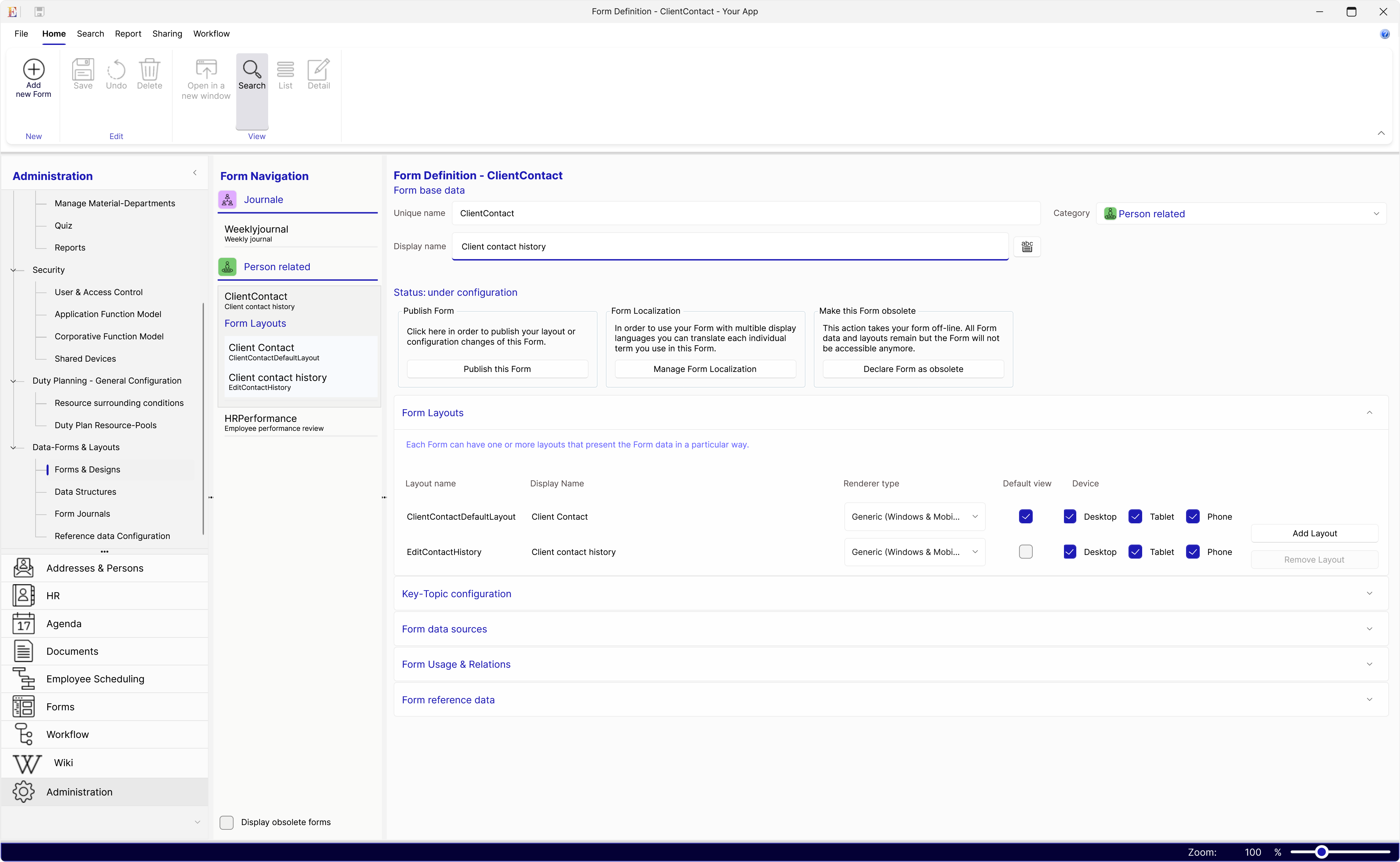
One design, multiple devices
User interfaces can be used across mobile phone and tablets (Android, iOS) and Windows desktop computers. The forms and content can also be deployed to your website.
Adaptive layouts
Layouts designed with the Blueskin Form-Builder are optimized to be presentable on all different screen sizes and devices. Nevertheless, it is built in a way that allows you to create multiple layout views for one usage scenario as well. This becomes handy in these situations.
- Having a view that only presents the most relevant data, like a dashboard, and providing navigation buttons to link to views with more detail.
- Having different views for the same usage-scenario whereas some views are only accessible when a user has sufficient privileges.
- You want to present optimized views for a certain screen size, for instance a optimized view for mobile phones.